


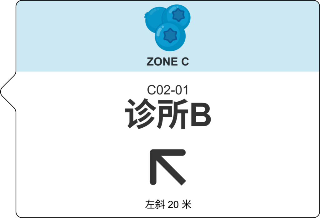
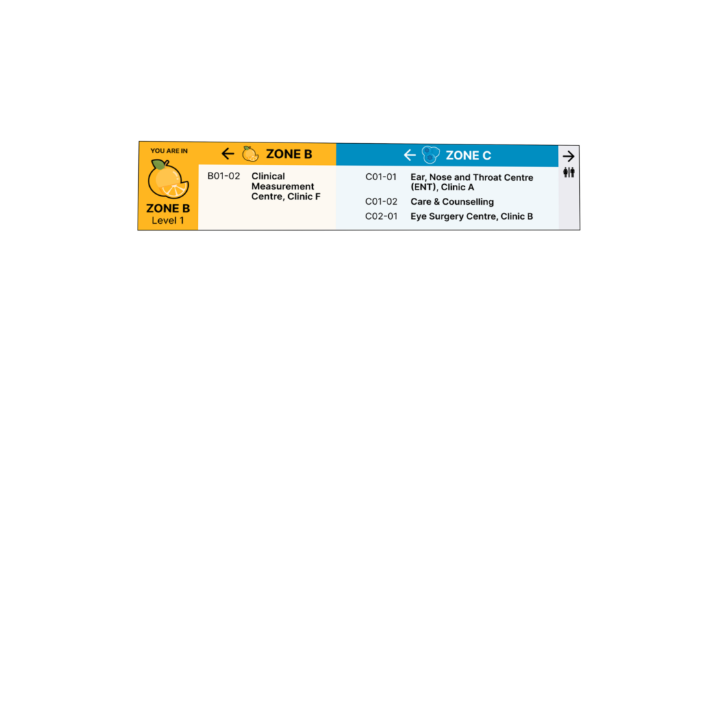
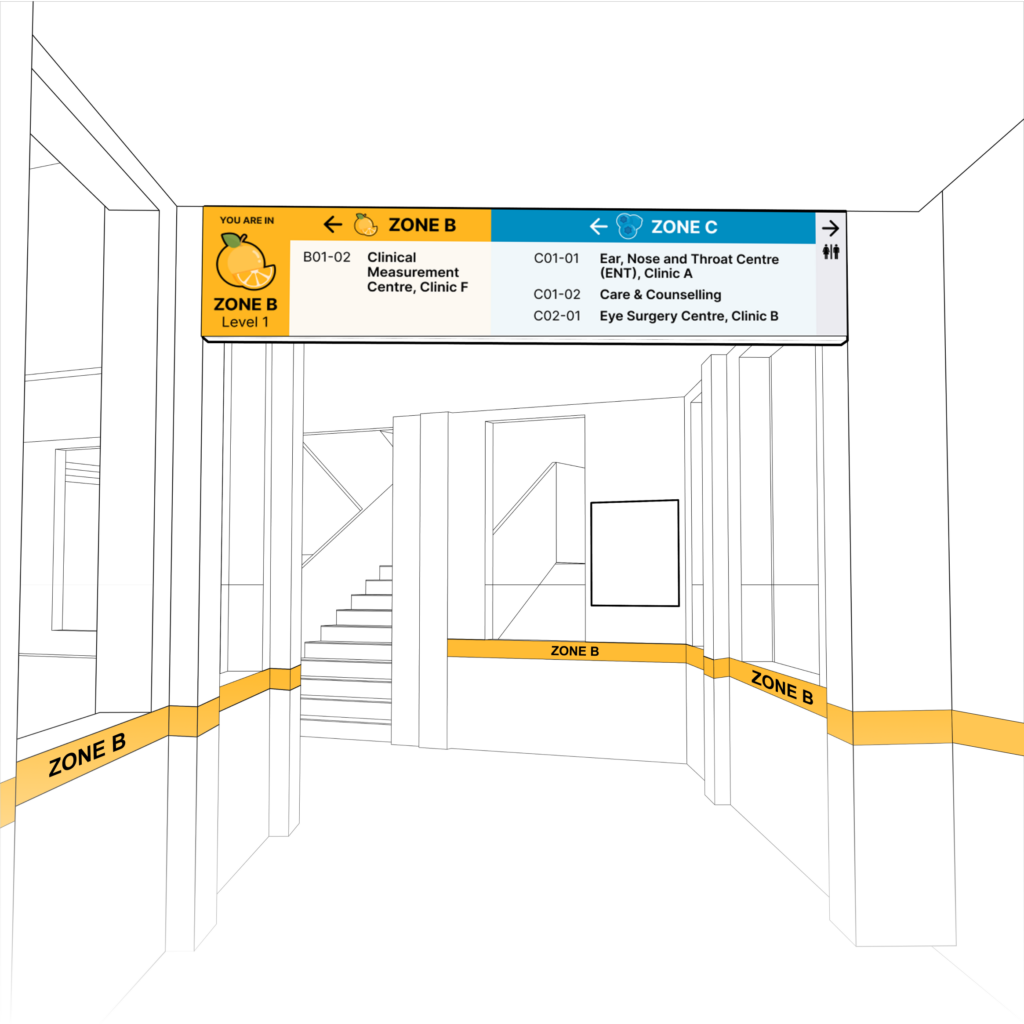
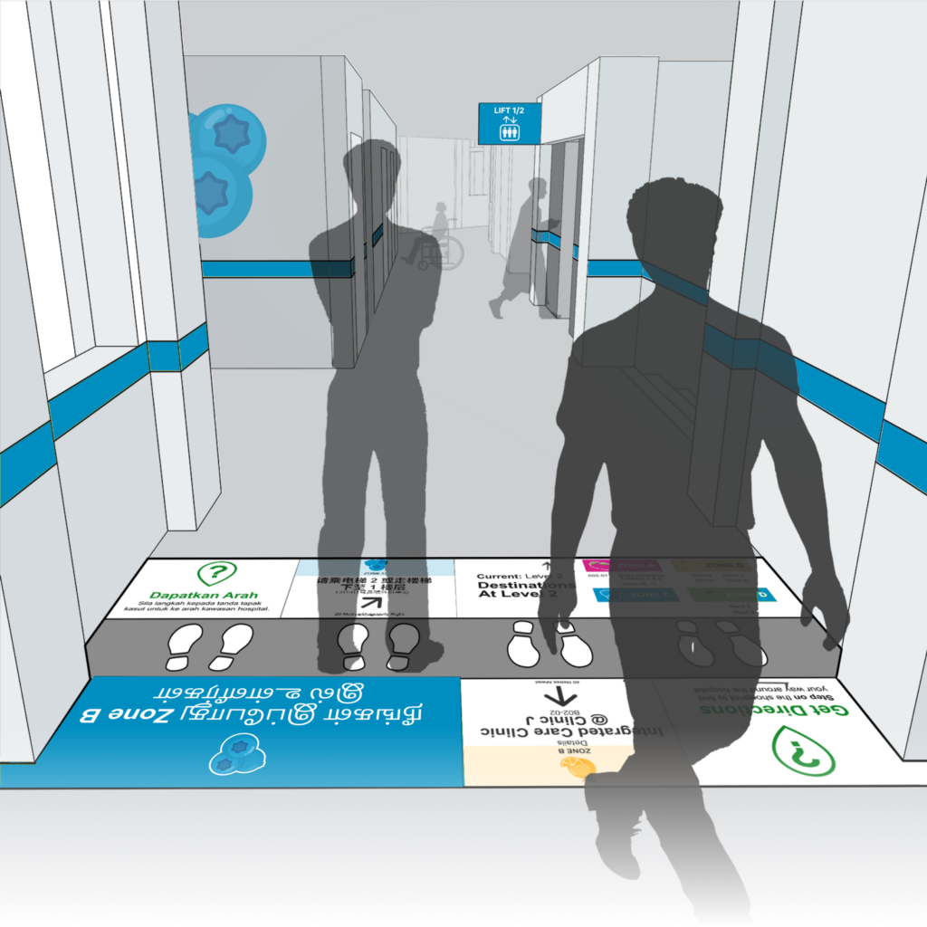
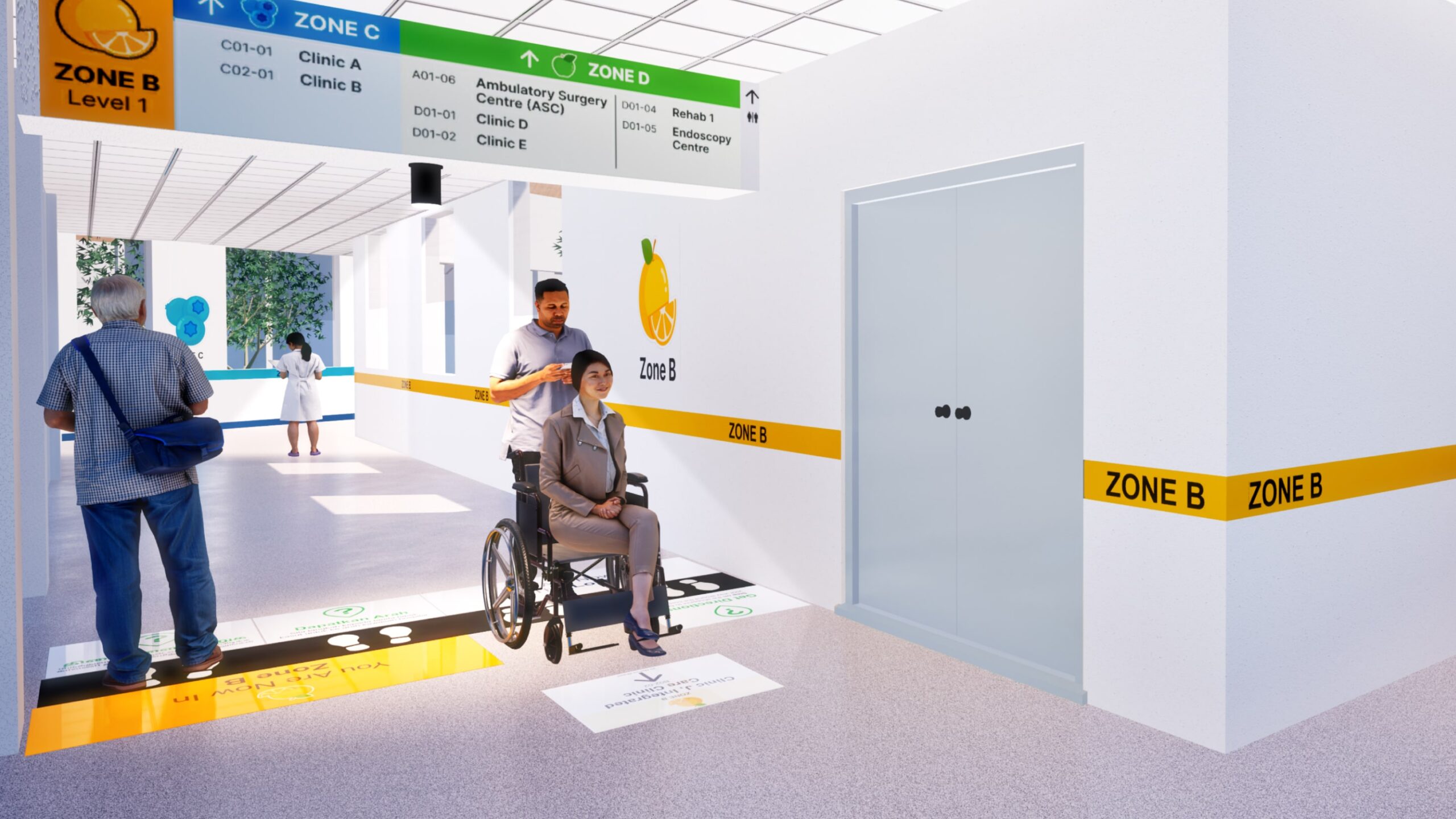
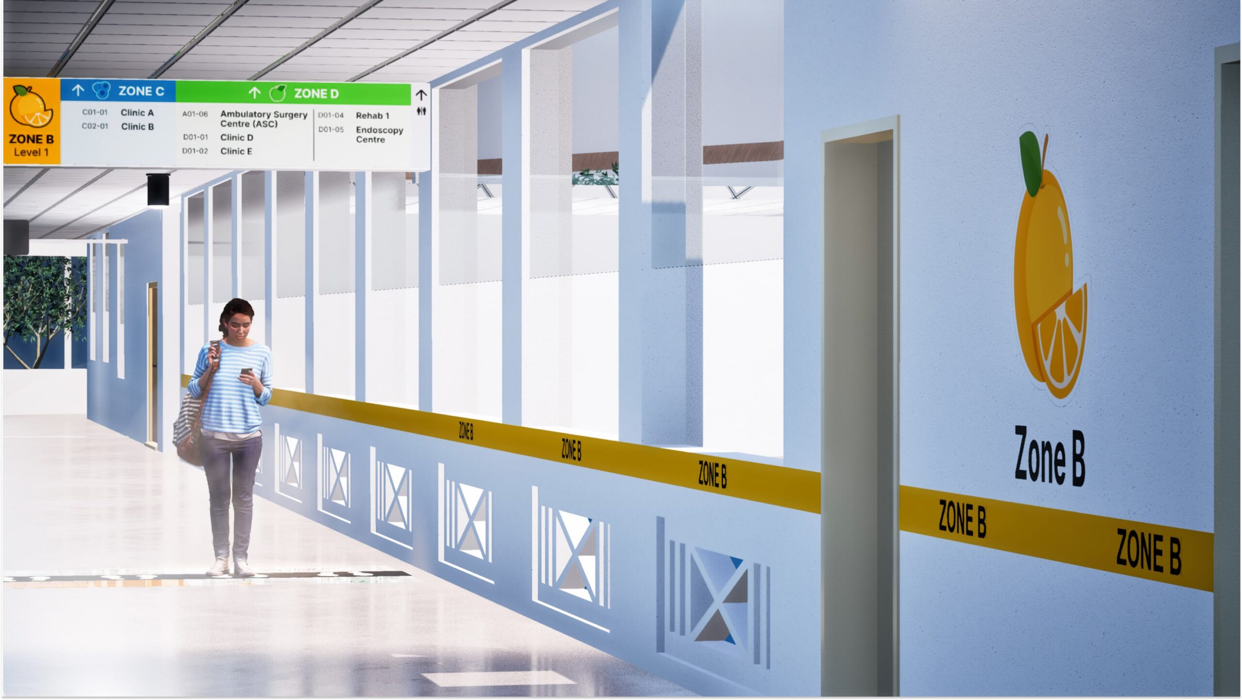
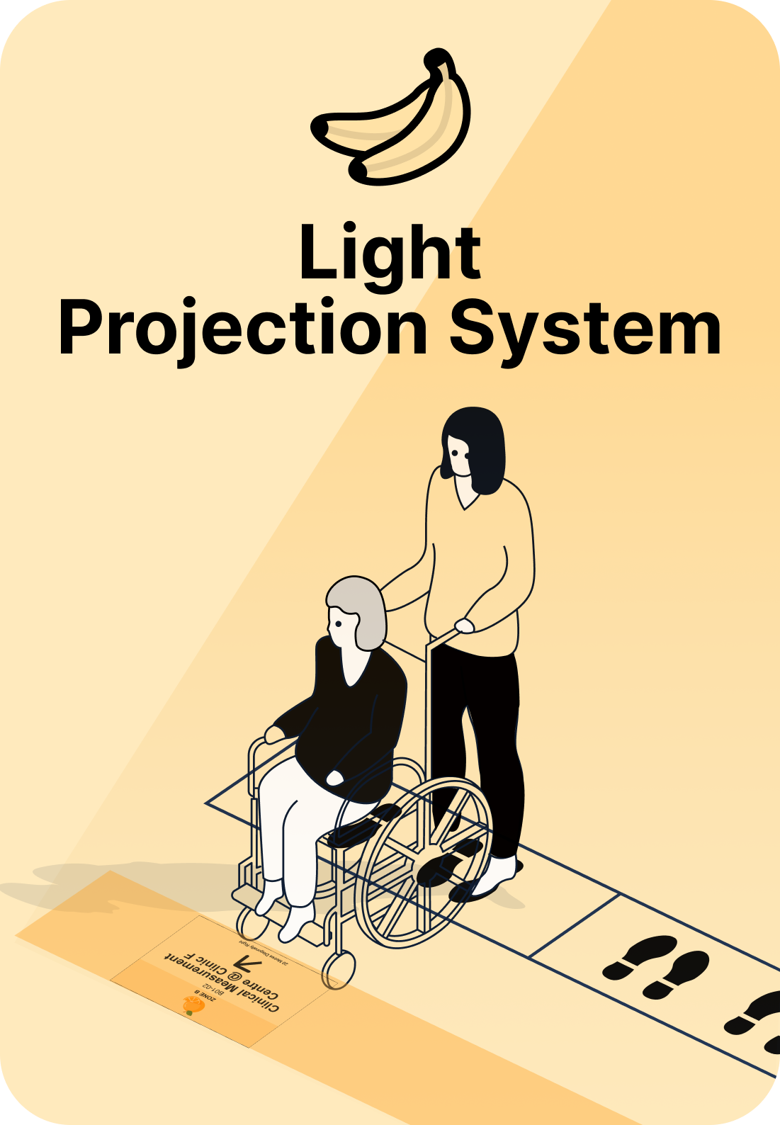
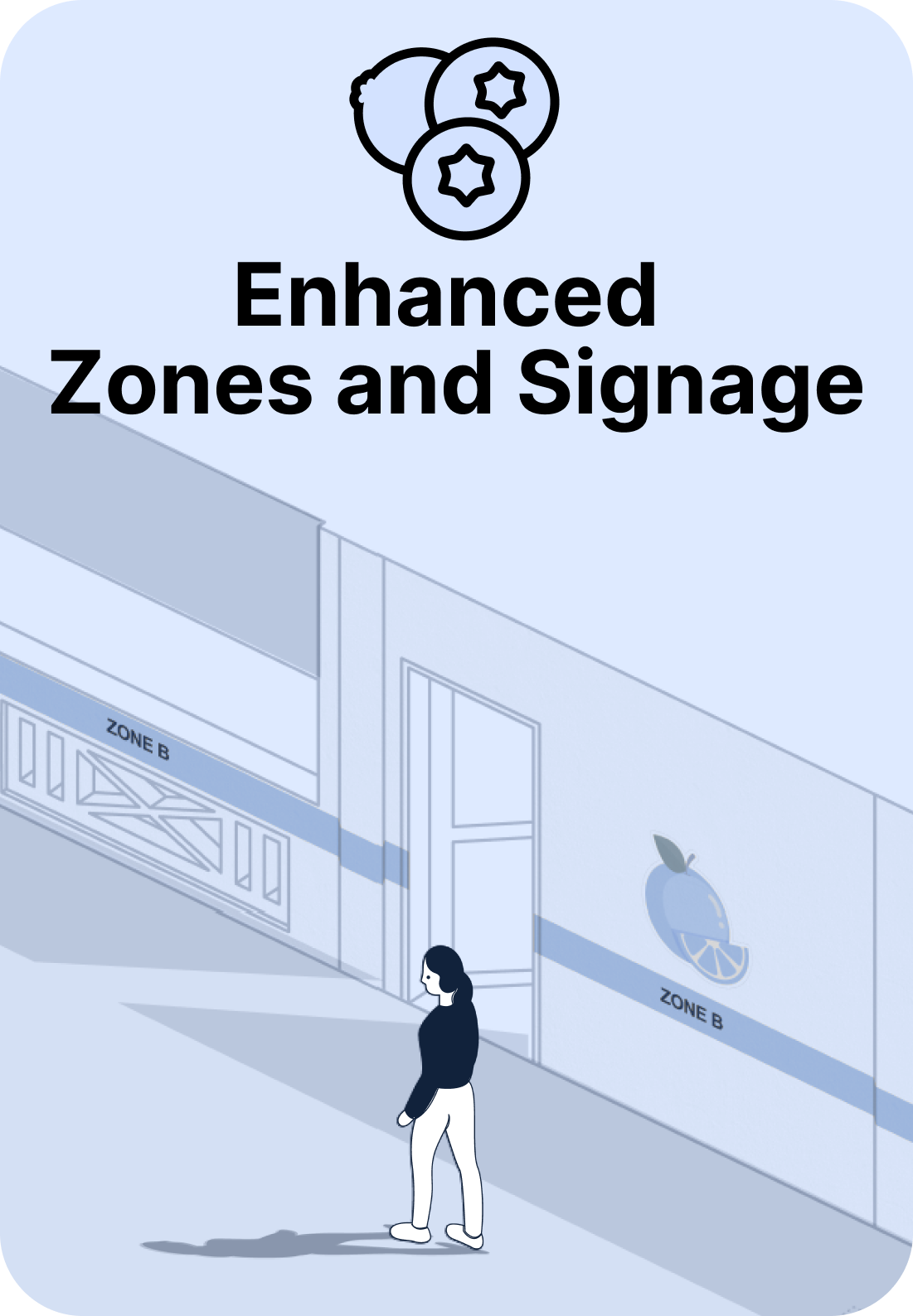

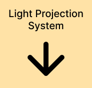


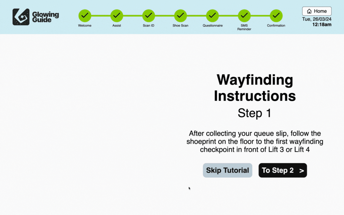

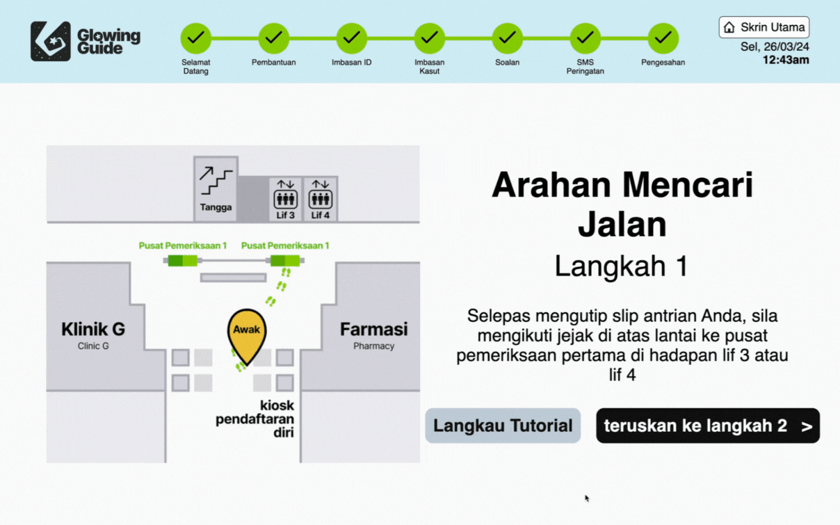


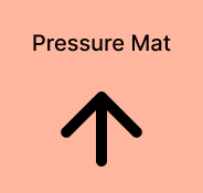


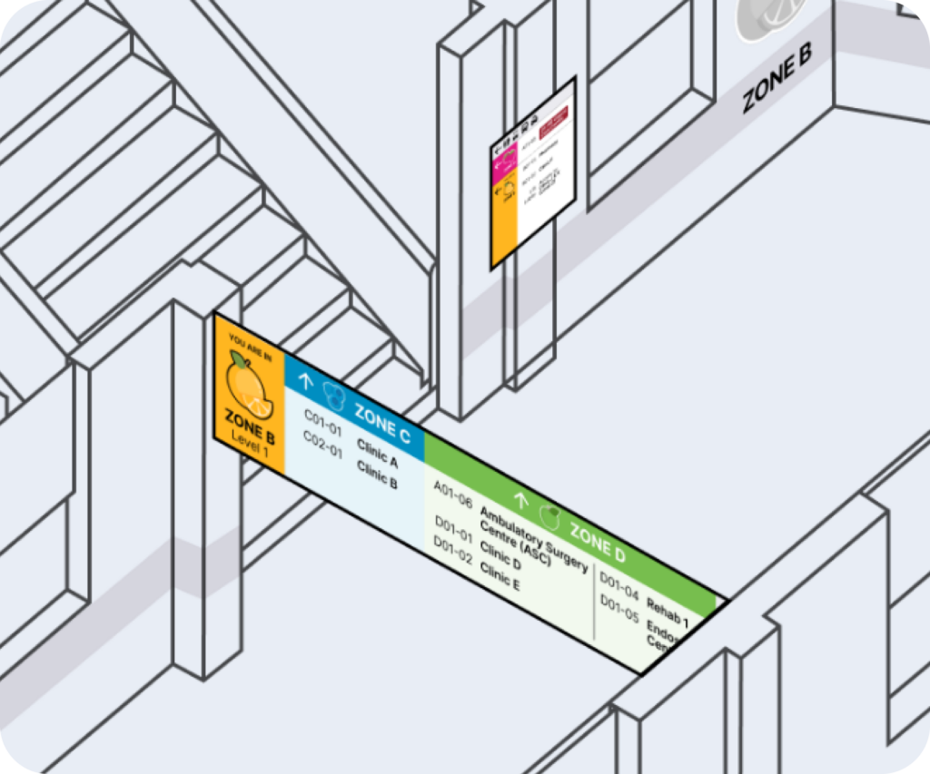
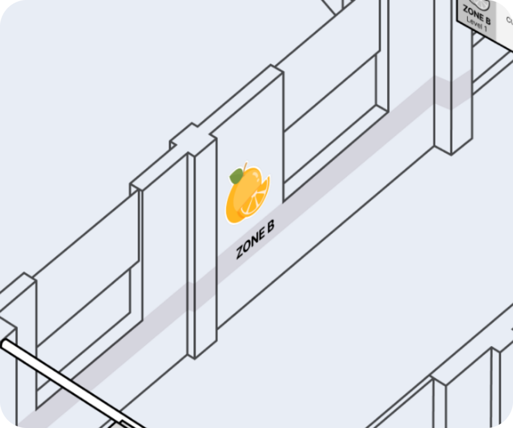
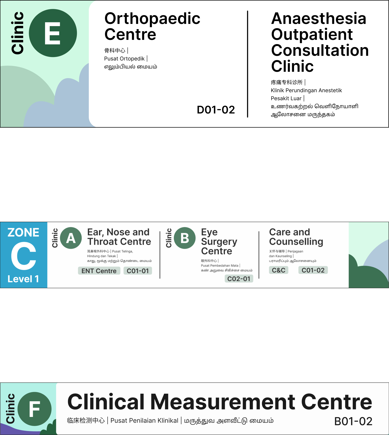
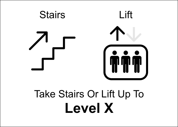
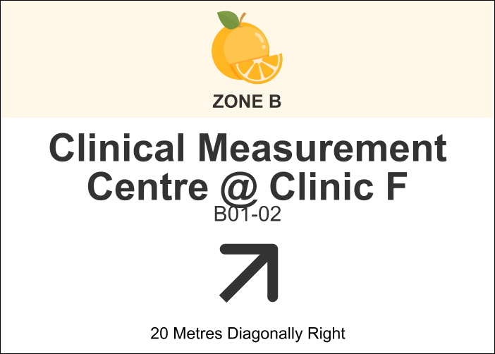
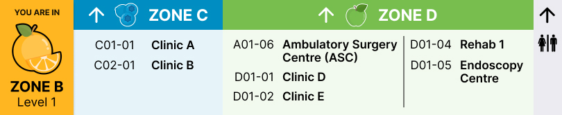
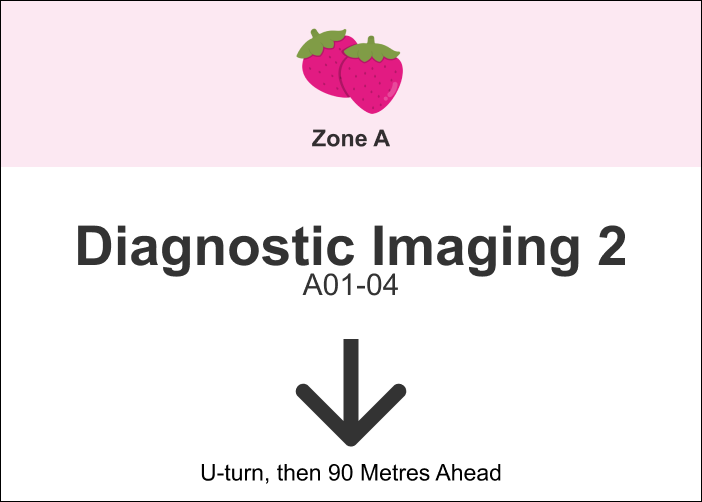
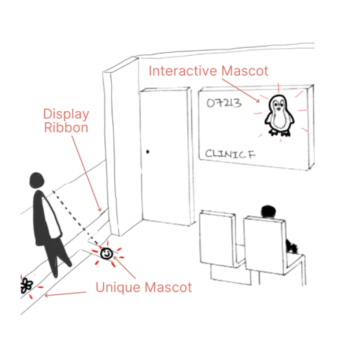
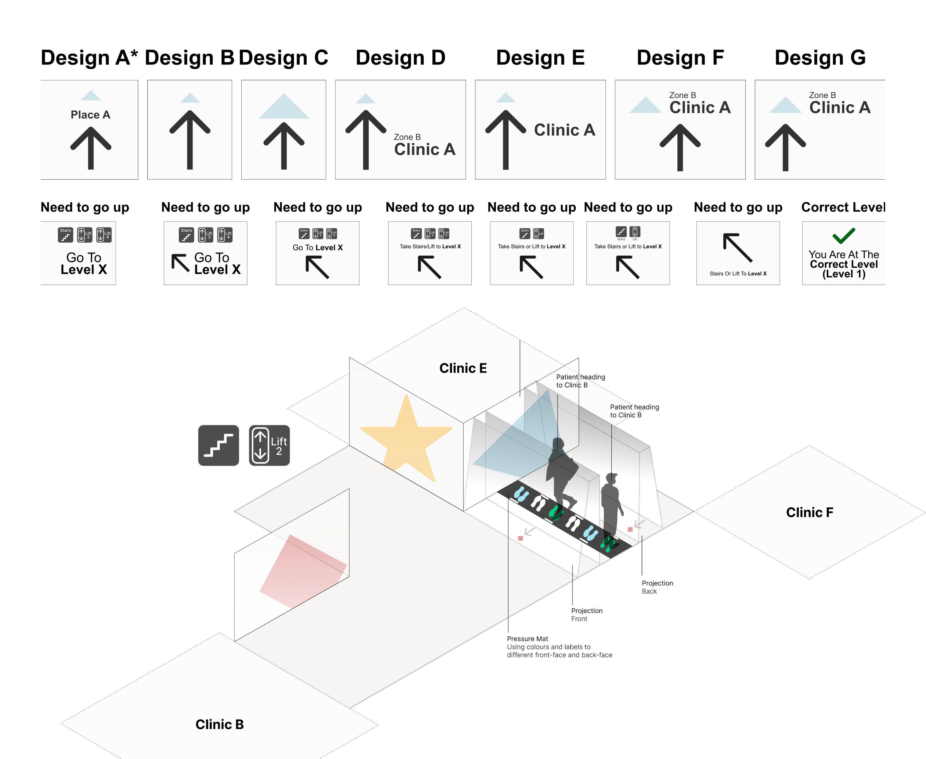
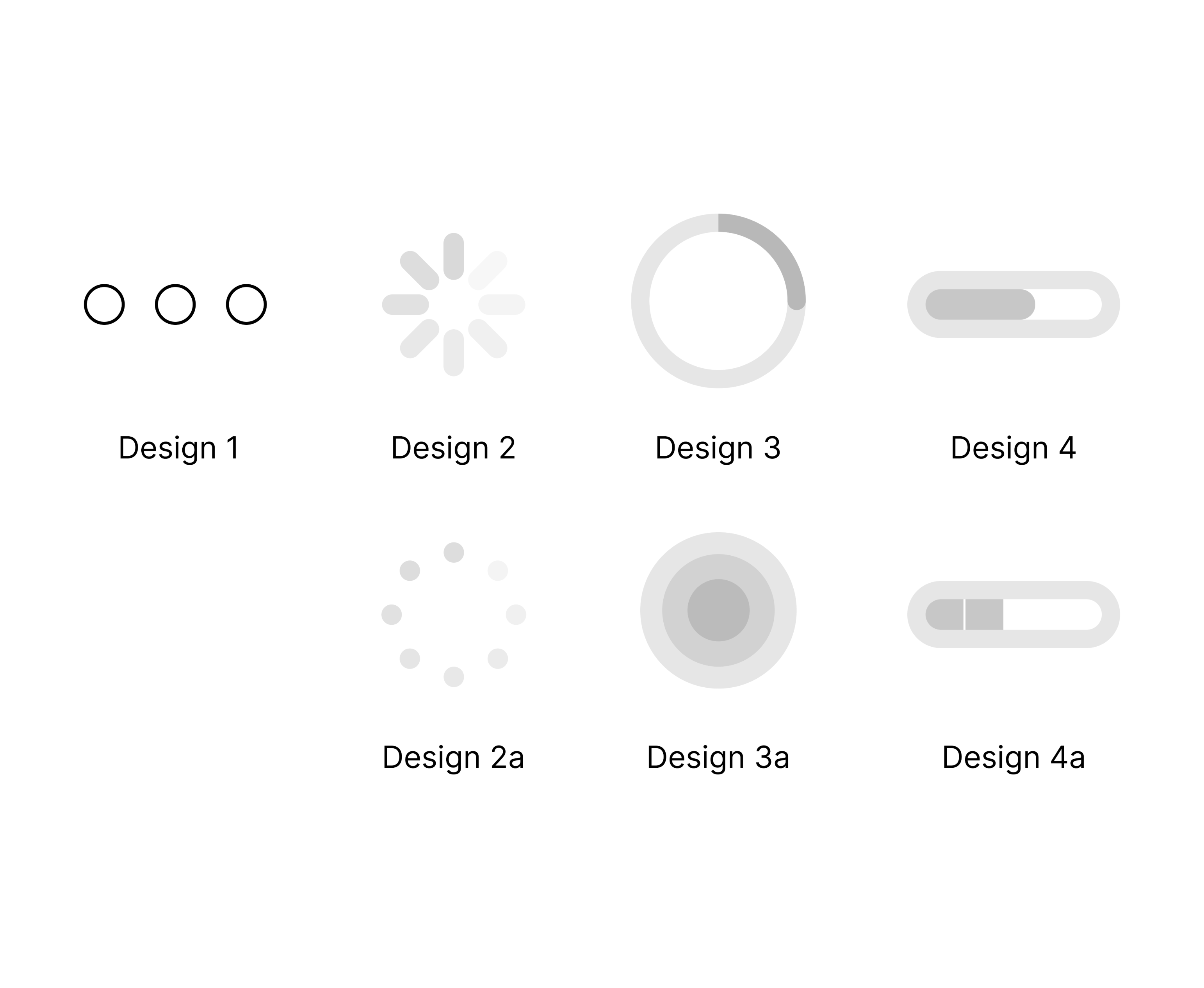
Large Relevant Symbol
Title
Description
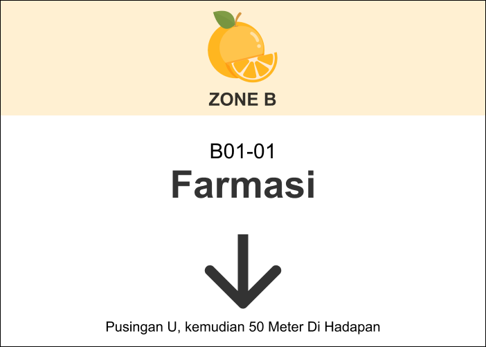
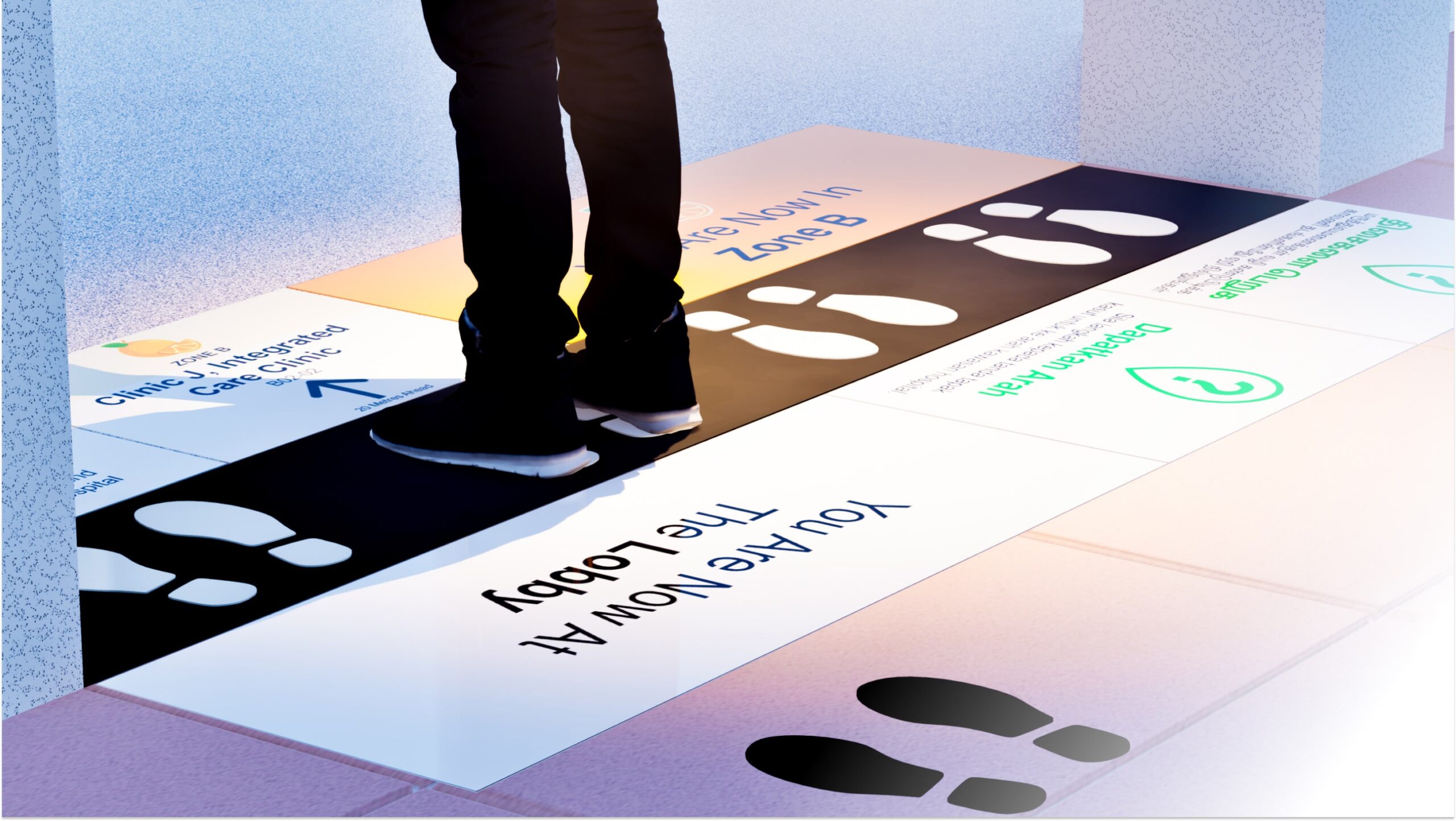
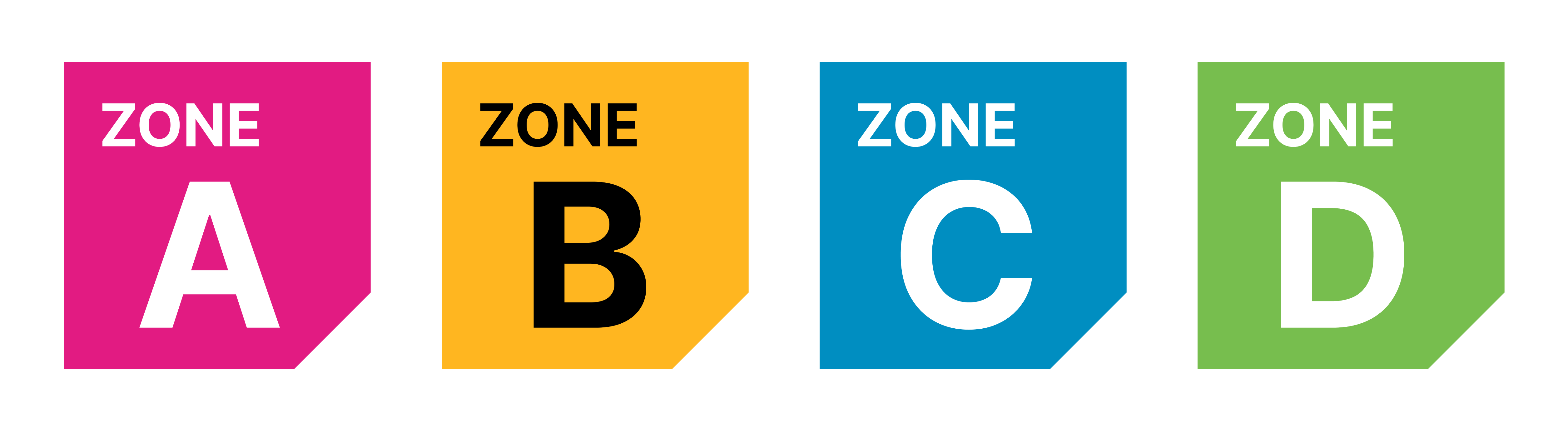
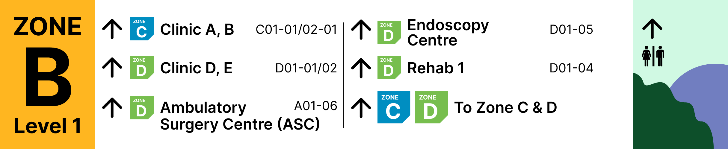
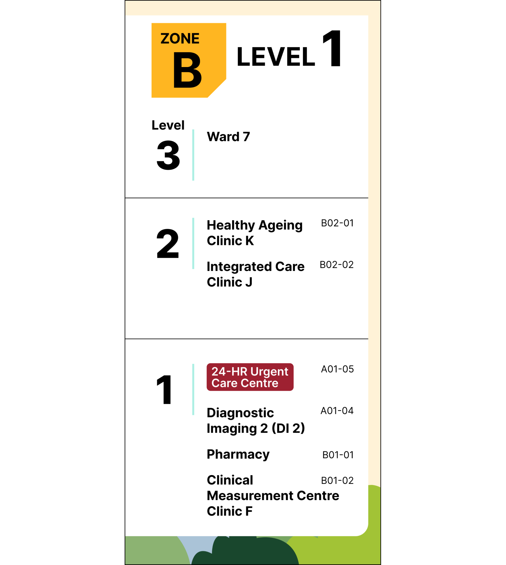
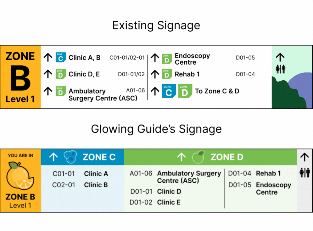
Zone
Name of place and clinic number
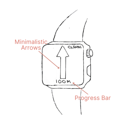
Large arrow with explicit directions for clarity
High Contrasting Colours


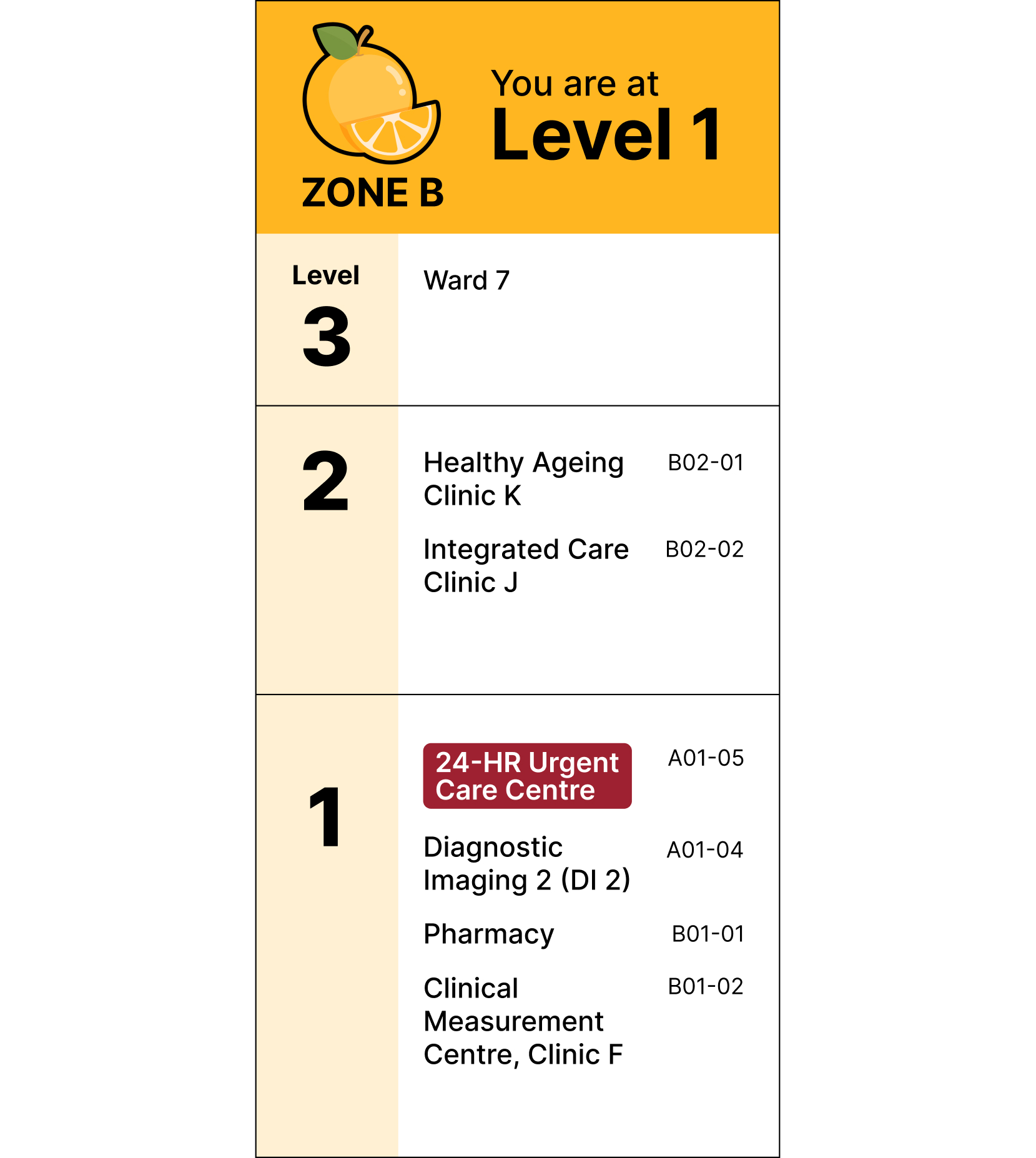


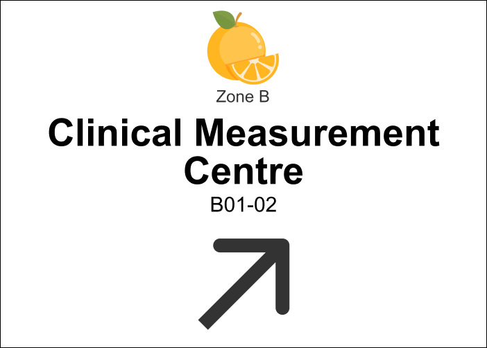

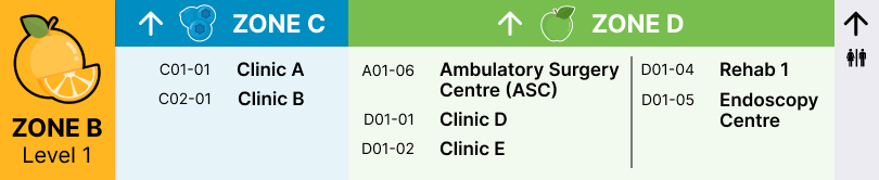
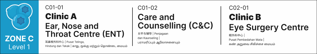

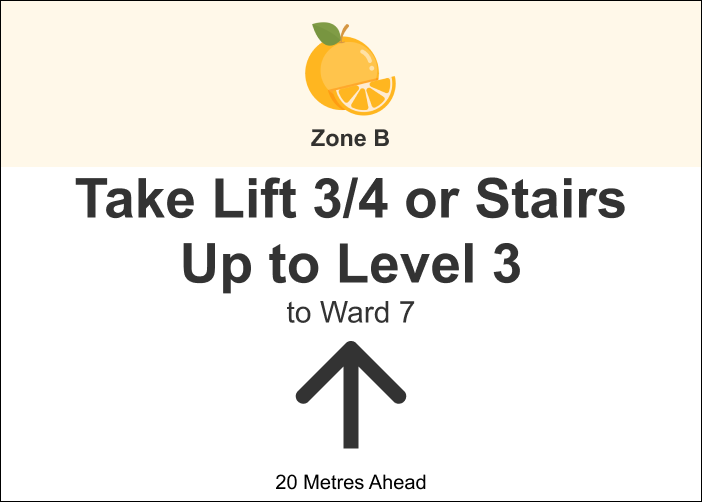


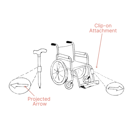


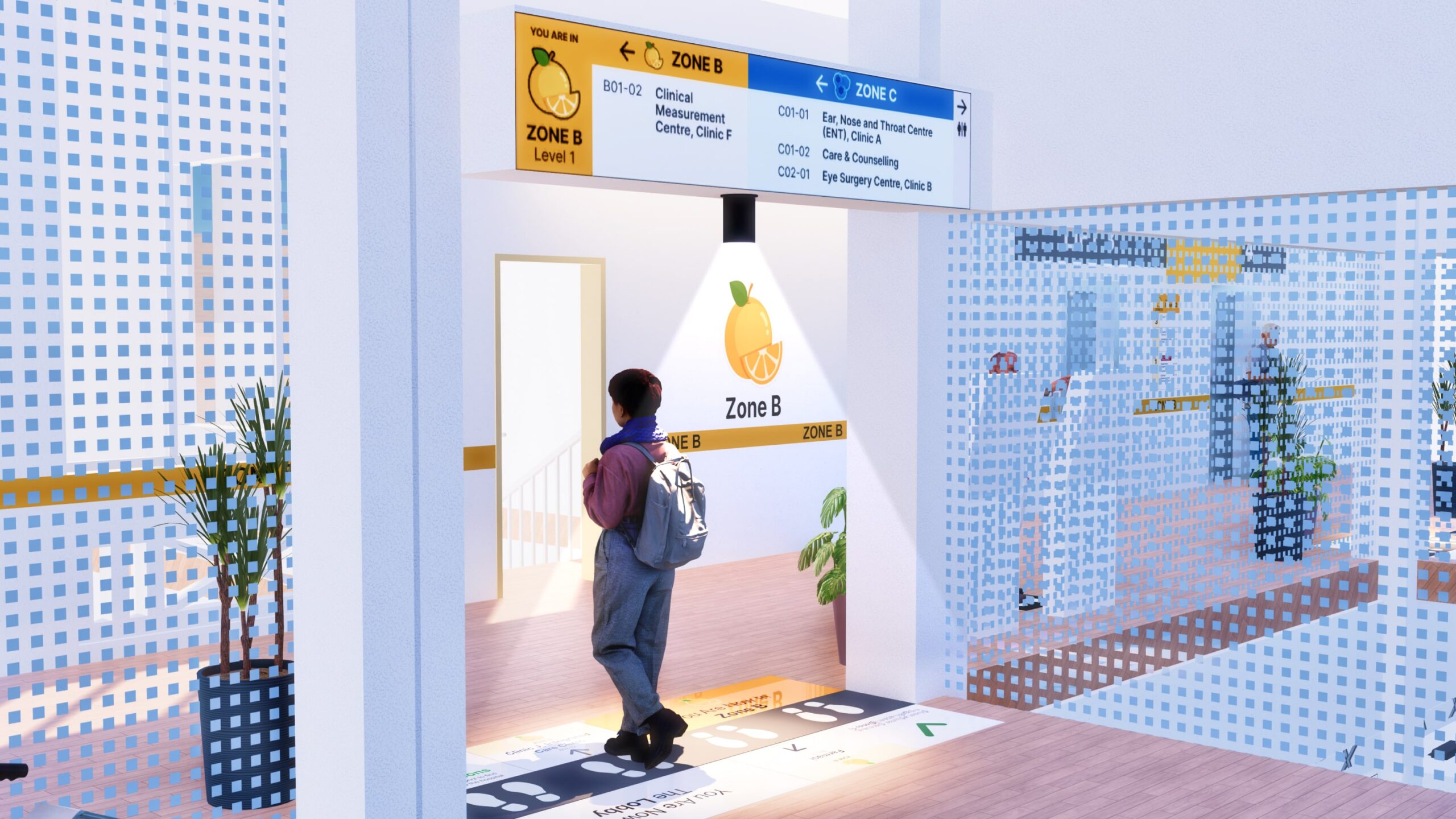
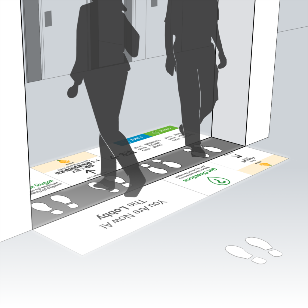
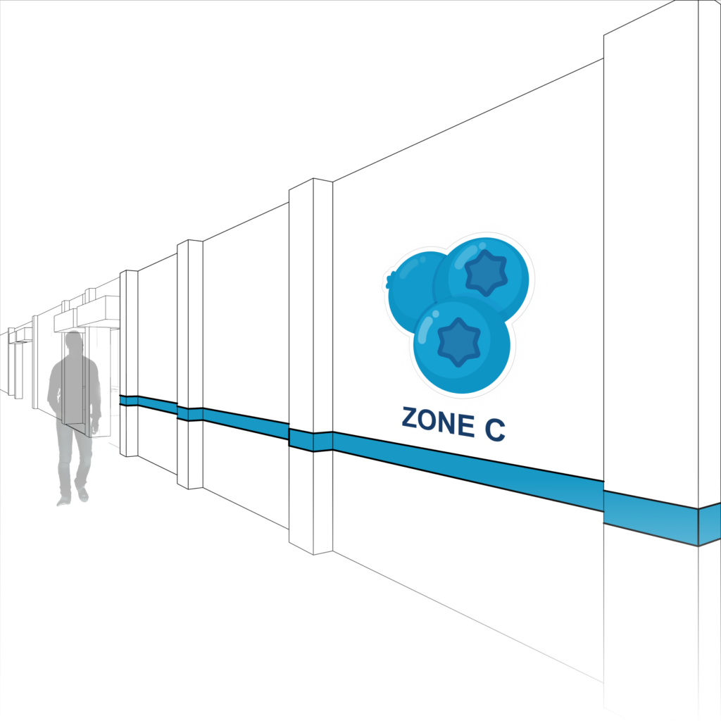
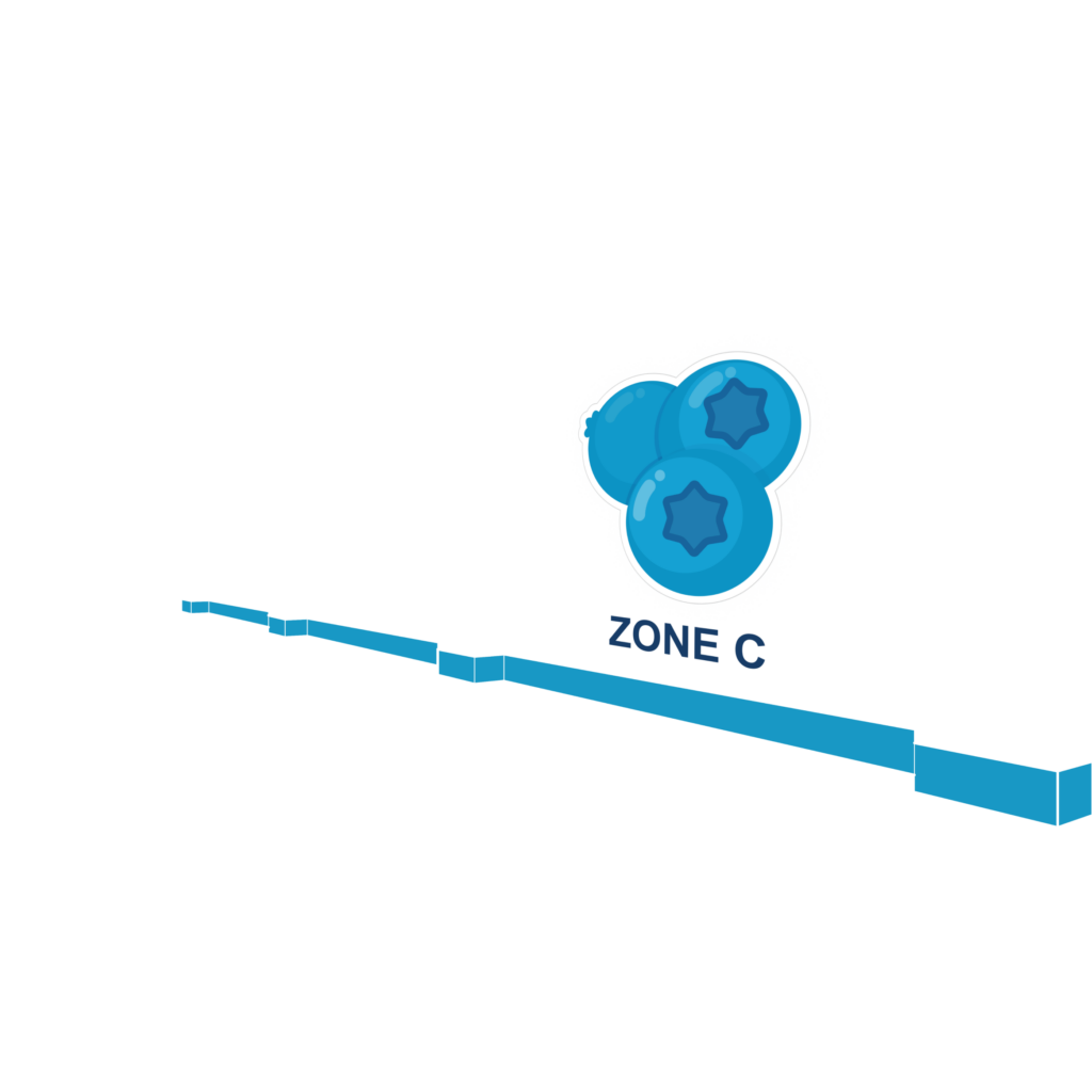
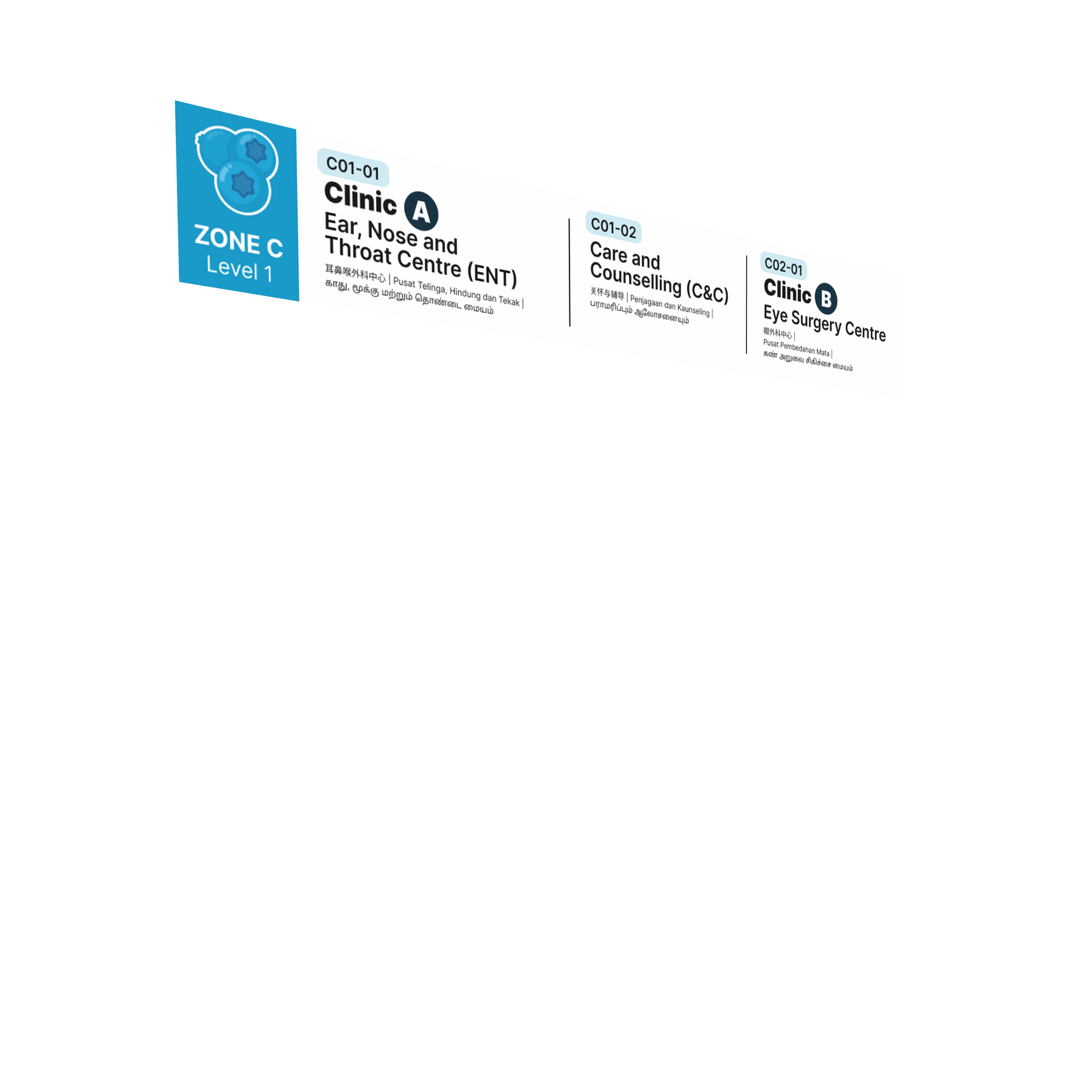
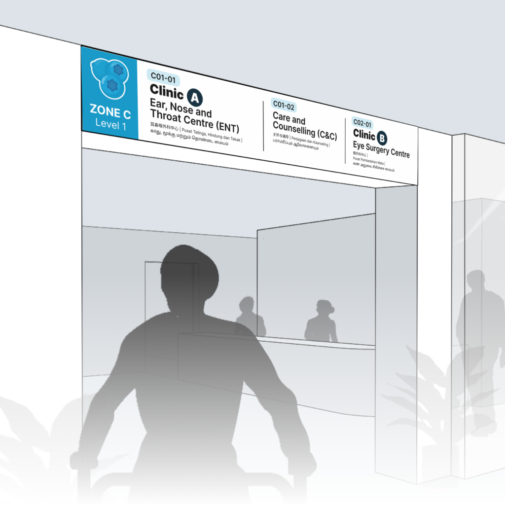
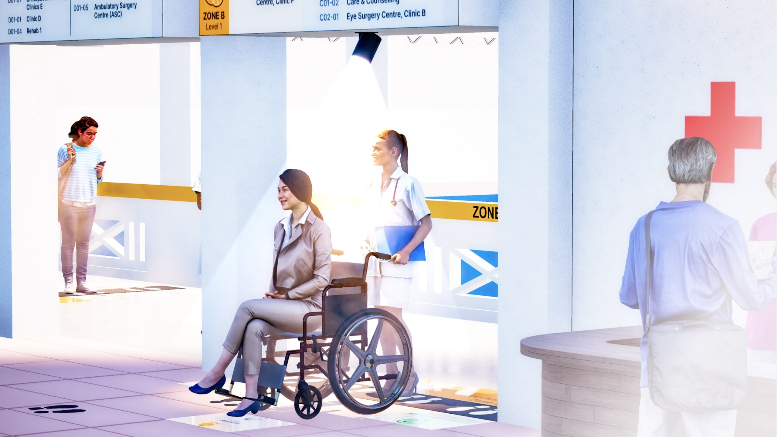
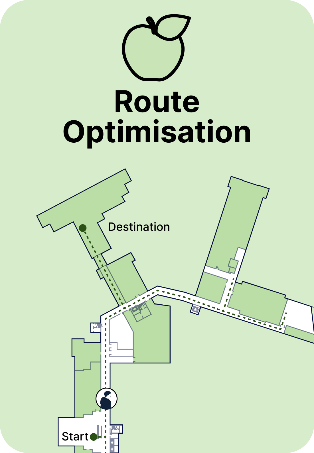
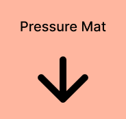
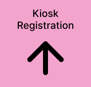
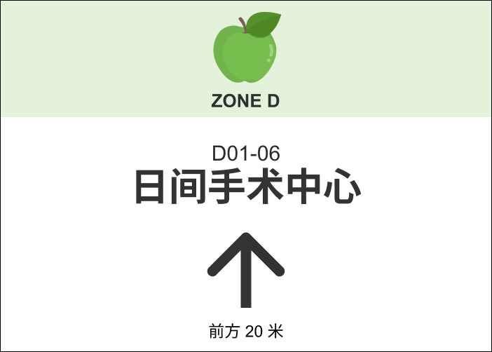
Large Relevant Symbol
Title
Description
Zone
Name of place and clinic number
Large arrow with explicit directions for clarity
High Contrasting Colours